组件说明
组件开发文件位置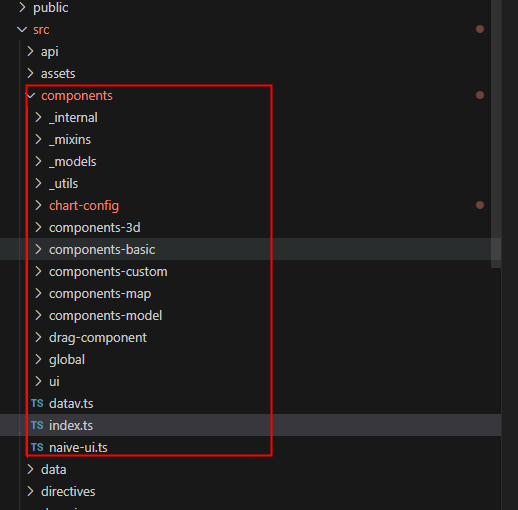
图表配置 chart-config
全局配置文件
ts
//动画初始配置 components/chart-config/animation/config
useChartAnimationConfig()

// X轴初始配置 components/chart-config/xAxis/config
xAxisConfig

// 通用基础配置 components/chart-config/public/chartFont
chartLineStyle

// 柱状图公共属性  components/chart-config/bar/config
useChartBarPubConfig()
useChartBarConfig()
useChartBaseLabel()

// 折线图初始配置 components/chart-config/line/config
useChartLineConfig

// 图例初始配置 components/chart-config/legend/config
chartLegendConfig

// 饼图初始配置  components/chart-config/pie/config
useChartPieConfig()

// 图形初始配置  components/chart-config/polar/config
chartPolarConfig()

// 拐点标记初始配置 components/chart-config/symbol/config
useSymbolConfigFunc()

// 径向轴初始配置 components/chart-config/radius-axis/config
chartRadisAxisConfig()

// 标题初始配置 components/chart-config/title/config
useTitleConfig()

// 提示框初始配置  components/chart-config/tooltip/config
tooltipConfig

// Y轴初始配置 components/chart-config/yAxis/config
yAxisConfig
角度轴配置 ChartAngleAxisConfig
template
<!-- components/chart-config/angle-axis/ChartAngleAxisConfig.vue -->
<ChartAngleAxisConfig :config="config.angleAxis"/>
ts
// 配置
config = {
  angleAxis: _.cloneDeep(useChartAngleAxisConfig({
    type: 'value',
    splitLine: {
      show: true,
      lineStyle: {
        ...chartLineStyle,  // 全局配置文件
        color: ['#4b4b4b'],
      },
    },
    axisTick: {
      show: false,
    },
  })),
}
动画 ChartAnimationConfig
template
<!-- components/chart-config/animation/ChartAnimationConfig.vue -->
<ChartAnimationConfig :config="config.animation"/>
ts
// 配置
config = {
  animation: _.cloneDeep(useChartAnimationConfig()),
}
X轴配置 ChartAxisConfig
template
<!-- components/chart-config/xAxis/ChartAxisConfig.vue -->
<ChartAxisConfig :config="config.xAxis" />
ts
// 配置
config = {
  // xAxisConfig全局配置
  xAxis: _.cloneDeep(xAxisConfig),
}
柱状图 ChartBarConfig ChartBarPubConfig
template
<!-- components/chart-config/bar/ChartBarConfig.vue.vue -->
<ChartBarConfig :config="config.bar" />

<!-- components/chart-config/bar/ChartBarPubConfig.vue -->
<ChartBarPubConfig :config="config.bar" />
ts
config = {
  bar: _.cloneDeep({
      ...useChartBarPubConfig(),
      ...useChartBarConfig(),
    }),
}
折线图 ChartBasicLineConfig
template
<!-- components/chart-config/line/ChartBasicLineConfig.vue -->
 <ChartBasicLineConfig :config="config.line" />
ts
config = {
  line: useChartLineConfig({}, true),
}
图表配置基础 ChartGenerateConfig
template
<!-- components/chart-config/generate/ChartGenerateConfig.vue -->
<ChartGenerateConfig  chart-type="null" :config="config"  :coms='{}' :chartType='bar || line || pie' />
ts
import { D3Bar } from './d3-bar'
const props = defineProps({
  com: {
    type: Object as PropType<D3Bar>,
    required: true,
  },
})
const config = toRef(props.com, 'config')
图例 ChartLegendConfig
template
<!-- components/chart-config/legend/ChartLegendConfig.vue -->
   <ChartLegendConfig :config="config.legend" />
ts
config = {
 legend: _.cloneDeep(chartLegendConfig),
}
饼图配置 ChartPieConfig
template
<!-- components/chart-config/pie/ChartPieConfig.vue -->
  <ChartPieConfig :config="config.pie" />
ts
config = {
 pie: useChartPieConfig(),
}
图形配置 ChartPolarConfig
template
<!-- components/chart-config/polar/ChartPolarConfig.vue -->
<ChartPolarConfig :config="config.global" />
ts
config = {
   global: {
      ...chartPolarConfig(),
    },
}
径向轴配置 ChartRadiusAxisConfig
template
<!-- components/chart-config/radius-axis/ChartRadiusAxisConfig.vue -->
<ChartRadiusAxisConfig :config="config.radiusAxis" />
ts
config = {
  radiusAxis: _.cloneDeep(chartRadisAxisConfig({
    axisTick: { show: false },
    axisLine: {
      show: true,
      symbol: ['none', 'none'], // none arrow
      symbolSize: [10, 15],
      lineStyle: {
        ...chartLineStyle,
        color: useChartColor({ value: '#4b4b4b' }),
      },
    },
    splitLine: {
      show: true,
      lineStyle: {
        ...chartLineStyle,
        color: ['#4b4b4b'],
      },
    },
  }
)),
}
拐点标记配置 ChartSymbolConfig
template
<!-- components/chart-config/symbol/ChartSymbolConfig.vue -->
<ChartSymbolConfig :config="config.symbol" />
ts
config = {
  symbol: useSymbolConfigFunc(),
}
标题配置ChartTitleConfig
template
<!-- components/chart-config/title/ChartTitleConfig.vue -->
   <ChartTitleConfig :config="config.title" />
ts
config = {
  title: useTitleConfig(),
}
提示框配置ChartTooltipConfig
template
<!-- components/chart-config/tooltip/ChartTooltipConfig.vue -->
 <ChartTooltipConfig :config="config.tooltip" />
ts
config = {
  tooltip: _.cloneDeep(tooltipConfig),
}
Y轴配置ChartYxisConfig
template
<!-- components/chart-config/yAxis/ChartYxisConfig.vue -->
<ChartYxisConfig :config="config.yAxis" />
ts
config = {
      yAxis: _.cloneDeep(yAxisConfig),
}
global自定义组件
TIP
global自定义组件时对于第三方插件进行二次封装
地图选择区域 GlSelectMap
template
<GlSelectMap :center='' @submit='submit' />ts
const props = defineProps({
  // 高德地图自定义样式
  mapStyle: {
    type: String,
    defualt: '',
  },
  // 缩放级别
  zoom:{
    type: Number,
    defualt: 4,
  },
  zooms:{
    type: Array,
    defualt: [],
  },
  // 中心点
  center:{
    type: Array,
    defualt: [],
  },
  // 填充颜色
  fillColor:{
    type: String,
    defualt: '',
  },
  // 边际线的颜色
  strokeColor:{
    type: String,
    defualt: '',
  },
  // 填充透明度
  fillOpacity:{
    type: Number,
    defualt: 0.7,
  },
  // 已选中的区域
  abcodeList:{
    type: Array,
    defualt: [],
  },
})
Naive UI 轮播图 GlCarousel
template
<GlCarousel />ts
const props = defineProps({
  length: {
    type: Number,
    default: 10,
  },
  // 每一页显示的轮播图数
  size:{
    type: Number,
    default: 1,
  },
  // 轮播图之间的间距
  spaceBetween:{
    type: Number,
    default: 20,
  },
  // 是否循环播放
  loop:{
    type:Boolean,
    default: true,
  },
  // 是否自动播放
  autoplay:{
    type:Boolean,
    default: true,
  },
  // 是否通过鼠标拖拽切换轮播图
  draggable:{
    type:Boolean,
    default: true,
  },
  // 轮播图显示的方向
  direction: {
    type: String as PropType<'vertical' | 'horizontal'>,
    default: 'vertical',
  },
  // 轮播图切换时的过渡效果
  effect: {
    type: String as PropType<'slide' | 'fade' | 'card' | 'custom'>,
    default: 'slide',
  },
  interval:{
    type: Number,
    default: 2000,
  },
})
AI制图 GlChart
template
<GlChart @code='code' @close='close' />ts
const props = defineProps({
  // 是否显示
  show: {
    type: Boolean,
    defualt: false,
  },
})
数值动画 GlCountTo
template
<GlCountTo />ts
const props = defineProps({
  // 目标值
  num: {
    type: Number,
    default: 0,
  },
  // 数值动画起始值
  fromZero: {
    type: Boolean,
    default: false,
  },
  item: {
    type: Object,
    default: () => ({
      // prefix:'', 前缀
      // suffix:'', 后缀
      // animation:{
      //   active:'',  是否开始动画
      //   precision:'', 精度,保留小数点后几位
      //   duration:'', 动画持续时间
      //   showSeparator:'', 是否显示分隔符
      // }
    }),
  },
})
图标选择组件 GlIconPicker
template
<GlIconPicker v-model='' />ts
const props = defineProps({
  // 绑定的值
  modelValue: {
    type: String,
    default: '',
  },
  // 标签名
  label: {
    type: String,
    default: '',
  },
})
三维地图 GlMarSMap
template
<GlMarSMap @onload='onload(event)' @onclick='onclick(event)' @ondblclick='ondblclick(event)' />ts
const props = withDefaults(
  defineProps<{
    url: string
    mapKey?: string
    options?: any
  }>(),
  {
    url: '',
    mapKey: 'default',
    options: () => ({}),
  },
)
图片卡片 GlSelectCard
template
<GlSelectCard />ts
const props = defineProps({
  // 绑定值
  modelValue: {
    type: String,
    default: '',
  },
  // 列表值
  data: {
    type: Array<{ id: string; value: string; }>,
    default: ()=> [],
  },
})
Swiper轮播图 GlSwiper
template
<GlSwiper />ts
const props = defineProps({
  length: {
    type: Number,
    default: 10,
  },
  // 行数
  row: {
    type: Number,
    default: 1,
  },
  // 列数
  col: {
    type: Number,
    default: 4,
  },
  // 循环
  loop: {
    type: Boolean,
    default: true,
  },
  // 间隔
  spaceBetween: {
    type: Number,
    default: 8,
  },
  // 自动轮播
  autoplay: {
    type: Object,
    default: () => {
      return {
        autoplay: true,
        delay: 3000,
        pauseOnMouseEnter: true,
      };
    },
  },
  effectCards: {},
  // 方向
  direction: {
    type: String as PropType<"vertical" | "horizontal">,
    default: "vertical",
  },
  grid: {
    type: Object,
    default: () => {
      return {
        fill: "column",
        rows: 2,
      };
    },
  },
  effect: {
    type: String as PropType<
      "slide" | "fade" | "cube" | "coverflow" | "flip" | "cards" | "creative"
    >,
    default: "slide",
  },
  grabCursor: {
    type: Boolean,
    default: true,
  },
  // 每次滚动条数
  slidesPerGroup: {
    type: Number,
    default: 1,
  },
});
ui样式组件
颜色选择器 GColorPicker
template
<g-color-picker v-model="" size="medium" />ts
defineProps({
  size: {
    type: String as PropType<'small' | 'medium' | 'large'>,
    default: 'small',
  },
  label: {
    type: String,
    default: '',
  },
  inline: {
    type: [Boolean, String],
    default: false,
  },
  // 允许图片
  allowImg: {
    type: Boolean,
    default: false,
  },
  allowType: {
    type:String as PropType< 'pure' | 'gradient' | 'both'>,
    default: 'both',
  },
  // 支持继承
  allowInherit: {
    type: Boolean,
    default: false,
  },
})
图表组件 GComIcon
template
<g-com-icon icon='' />ts
/**
 *  js
 * 没有icon时默认IconHelp
 **/
defineProps<{
  icon:string as PropType<
    'v-icon-chart' |
    'v-icon-chart-bar' |
    'v-icon-chart-line' |
    'v-icon-chart-pie'|
    'v-icon-relation' |
    'v-icon-map' |
    'v-icon-title' |
    'v-icon-interact' |
    'v-icon-material' |
    'v-icon-com-info' |
    'v-icon-table' |
    'v-icon-media' |
    'v-icon-other' |
    'v-icon-view-grid' |
    'v-icon-favorite' |
    'v-icon-model' |
  >
}>()
标签栅格 GField
template
<g-field :label='' :tooltip=''> <slot></slot> <g-field/>ts
const props = defineProps({
  label: {
    type: String,
    required: true,
  },
  tooltip: String,
  toggle: Boolean,
  modelValue: {
    type: Boolean,
    default: true,
  },
  level: {
    type: Number,
    default: 1,
  },
  nest: Boolean,
  caption: String,
  disabled: Boolean,
  isFlat: Boolean,
  labelSpan: {
    type: Number,
    default: 7,
  },
})
折叠列表 GFieldCollapse
template
<g-field-collapse :label='' :tooltip=''> <slot></slot> <g-field-collapse />ts
const props = defineProps({
  mode: {
    type: String as PropType<'' | 'layout'>,
    default: '',
  },
  label: {
    type: String,
    required: true,
  },
  tooltip: {
    type: String,
  },
  toggle: {
    type: Boolean,
    default: false,
  },
  modelValue: {
    type: Boolean,
    default: true,
  },
  defaultLayout: {
    type: String as PropType<ToolboxType.horizontal | ToolboxType.vertical>,
    default: ToolboxType.horizontal,
  },
  features: {
    type: Array as PropType<ToolboxType[]>,
    default: () => [],
  },
  list: Array,
  min: {
    type: Number,
    default: 0,
  },
  max: {
    type: Number,
    default: 1000,
  },
  tab: {
    type: [String, Function],
  },
  addItem: {
    type: Function,
    default: () => {},
  },
  autoOpen: {
    type: Boolean,
    default: false,
  },
  dIndex: {
    type: Number,
    default: 0,
  },
})
输入框 GInput
template
<g-input v-model="" :label='' />ts
defineProps({
  modelValue: {
    type: [String],
    default: '',
  },
  label: {
    type: String,
    default: '',
  },
  size: {
    type: String as PropType<Size>,
    default: 'small',
  },
  inline: {
    type: [Boolean, String],
    default: false,
  },
  placeholder: {
    type: String,
    default: '请输入',
  },
})
数字输入框 GInputNumber
template
<g-input-number v-model="" :label='' />ts
const props = defineProps({
  modelValue: {
    type: Number,
    default: 0,
  },
  label: {
    type: String,
    default: '',
  },
  size: {
    type: String as PropType<Size>,
    default: 'small',
  },
  min: {
    type: Number,
    default: -Infinity,
  },
  max: {
    type: Number,
    default: Infinity,
  },
  step: {
    type: Number,
    default: 1,
  },
  inline: {
    type: [Boolean, String],
    default: false,
  },
  prefix: String,
  suffix: String,
})
全局配置 GInputPersent
template
<g-input-persent v-model="" :label='' />ts
const props = defineProps({
  modelValue: {
    type: Object as PropType<{
      isPersent: boolean
      value: number
    }>,
    default: () => ({
      isPersent: false,
      value: 0,
    }),
  },
  label: {
    type: String,
    default: '',
  },
  size: {
    type: String as PropType<Size>,
    default: 'small',
  },
  min: {
    type: Number,
    default: -Infinity,
  },
  max: {
    type: Number,
    default: Infinity,
  },
  step: {
    type: Number,
    default: 1,
  },
  inline: {
    type: [Boolean, String],
    default: false,
  },
  prefix: String,
  suffix: String,
})
加载条 GLoading
template
<g-loading type="" :spinning="" ><slot></slot> </g-loading>ts
const props = defineProps({
  type: {
    type: String as PropType<'dna' | 'square'>,
    default: 'dna',
  },
  spinning: {
    type: Boolean,
    default: false,
  },
  theme: {
    type: String as PropType<'dark' | 'light'>,
    default: 'dark',
  },
  opacity: {
    type: Number,
    default: 1,
  },
  wrapClass: {
    type: String,
  },
  wrapStyle: {
    type: {} as PropType<Record<string, any>>,
  },
})
编辑器 GMonacoEditor
template
<g-monaco-editor language="" code="" />ts
const props = defineProps({
  language: {
    type: String as PropType<languageType>,
    default: 'plaintext',
  },
  code: {
    type: [String, Array, Object],
    default: '',
  },
  readOnly: Boolean,
  useMinimap: Boolean,
  lineNumbers: {
    type: String,
    default: 'on',
  },
  wordWrap: {
    type: String,
    default: 'on',
  },
  autoFormat: Boolean,
  options: {
    type: Object as PropType<Partial<MEditor.IStandaloneEditorConstructionOptions>>,
    default() {
      return {}
    },
  },
  completions: Array as PropType<Array<string>>,
  extra: Object,
  height: {
    type: Number,
    default: 240,
  },
  editorClass: String,
  fullScreenTitle: {
    type: String,
    default: '全屏模式',
  },
})
选择框 GSelect
template
<g-select v-model="" data="" label="" />ts
defineProps({
  modelValue: {
    type: [String, Number],
    default: 0,
  },
  data: {
    type: Array as PropType<{
      id?: string
      key?: string
      value: string
    }[]>,
    default: () => [],
  },
  label: {
    type: String,
    default: '',
  },
  size: {
    type: String as PropType<Size>,
    default: 'small',
  },
  inline: {
    type: [Boolean, String],
    default: false,
  },
  labelField: {
    type: String,
    default: 'value',
  },
  valueField: {
    type: String,
    default: 'id',
  },
  disabled: Boolean,
})
图片选择器 GSelectImage
template
<g-select-image v-model="" images="" />ts
type Placement = 'top' | 'bottom' | 'left' | 'right' | 'top-start' | 'top-end' | 'left-start' | 'left-end' | 'right-start' | 'right-end' | 'bottom-start' | 'bottom-end'
const props = defineProps({
  modelValue: {
    type: String,
    default: '',
  },
  images: {
    type: Array as PropType<BorderImage[]>,
    default: () => [],
  },
  label: {
    type: String,
    default: '',
  },
  inline: {
    type: [Boolean, String],
    default: false,
  },
  placement: {
    type: String as PropType<Placement>,
    default: 'left',
  },
})
形状选择器 GSelectShape
template
<g-select-shape v-model="" shapes="" />ts
interface ShapeType {
  id: string
  value: string
  icon?: string
}

const props = defineProps({
  modelValue: {
    type: [String, Number],
    default: 0,
  },
  shapes: {
    type: Array as PropType<ShapeType[]>,
    default: () => [],
  },
  label: {
    type: String,
    default: '',
  },
  size: {
    type: String as PropType<Size>,
    default: 'small',
  },
  inline: {
    type: [Boolean, String],
    default: false,
  },
  disabled: Boolean,
})
可以创建新的选项 GSelectSuggest
template
<g-select-suggest v-model="" data="" filters="" />ts
interface DataDto {
  id: string | number
  value: string | number
}
const props = defineProps({
  modelValue: {
    type: [String, Number],
    default: 0,
  },
  data: {
    type: Array as PropType<DataDto[]>,
    default: () => [],
  },
  label: {
    type: String,
    default: '',
  },
  size: {
    type: String as PropType<Size>,
    default: 'small',
  },
  inline: {
    type: [Boolean, String],
    default: false,
  },
  disabled: Boolean,
  filters: Array as PropType<(number | string)[]>,
})
滑动选择 GSlider
template
<g-slider v-model="" label="" size="" />ts
const props = defineProps({
  modelValue: {
    type: Number,
    default: 0,
  },
  label: {
    type: String,
    default: '',
  },
  size: {
    type: String as PropType<Size>,
    default: 'small',
  },
  min: {
    type: Number,
    default: -Infinity,
  },
  max: {
    type: Number,
    default: Infinity,
  },
  step: {
    type: Number,
    default: 1,
  },
  inline: {
    type: [Boolean, String],
    default: false,
  },
  suffix: String,
  disabled: Boolean,
})
范围选择 GSliderRange
template
<g-slider-range v-model="" label="" size="" />ts
const props = defineProps({
  modelValue: {
    type: Array as PropType<number[]>,
    default: () => [0, 1],
  },
  label: {
    type: String,
    default: '',
  },
  size: {
    type: String,
    default: 'small',
  },
  min: {
    type: Number,
    default: -Infinity,
  },
  max: {
    type: Number,
    default: Infinity,
  },
  step: {
    type: Number,
    default: 1,
  },
  inline: {
    type: [Boolean, String],
    default: false,
  },
  disabled: Boolean,
})
开关 GSwitch
template
<g-switch v-model="" label="" inline />ts
defineProps({
  modelValue: {
    type: Boolean,
    default: false,
  },
  label: {
    type: String,
    default: '',
  },
  size: {
    type: String as PropType<'medium' | 'small' | 'large'>,
    default: 'medium',
  },
  inline: {
    type: [Boolean, String],
    default: false,
  },
  disabled: Boolean,
})
信息提示 GTooltipPopover
template
<g-tooltip-popover content="" ><slot></slot></g-tooltip-popover>ts
type Placement = 'top' | 'bottom' | 'left' | 'right' | 'top-start' | 'top-end' | 'left-start' | 'left-end' | 'right-start' | 'right-end' | 'bottom-start' | 'bottom-end'
defineProps({
  trigger: {
    type: String as PropType<PopoverTrigger>,
    default: 'hover',
  },
  placement: {
    type: String as PropType<Placement>,
    default: 'bottom',
  },
  delay: {
    type: Number,
    default: 500,
  },
  content: String,
})
上传图片 GUploadImage
template
<g-upload-image v-model="" />ts
const props = defineProps({
  modelValue: String,
  allowType: {
    type: String,
    default: '',
  },
  size: {
    type: Number,
    default: 20,
  },
  action: {
    type: String,
    default: import.meta.env.VITE_UPLOAD_URL,
  },
  previewHost: {
    type: String,
    default: import.meta.env.VITE_LOAD_URL,
  },
  label: {
    type: String,
    default: '',
  },
  inline: {
    type: [Boolean, String],
    default: false,
  },
})
上传文件 GUoloadFile
template
<g-upload-file v-model="" />ts
const props = defineProps({
  modelValue: String,
  allowType: {
    type: String,
    default: "",
  },
  accept: {
    type: String,
    default: "*",
  },
  size: {
    type: Number,
    default: 20,
  },
  action: {
    type: String,
    default: import.meta.env.VITE_UPLOAD_URL,
  },
  previewHost: {
    type: String,
    default: import.meta.env.VITE_LOAD_URL,
  },
  label: {
    type: String,
    default: "",
  },
  inline: {
    type: [Boolean, String],
    default: false,
  },
  dir: {
    type: String,
    default: "",
  },
  mutil: {
    type: Boolean,
    default: false,
  },
});
上传视频 GUoloadVideo
template
<g-upload-video v-model="" />ts
 const props =defineProps({
    modelValue: {
      type: String,
      required: true,
    },
    allowType: {
      type: String,
      default: 'mp4,webm',
    },
    size: {
      type: Number,
      default: 10,
    },
    action: {
      type: String,
      default: uploadHost,
    },
    previewHost: {
      type: String,
      default: previewHost,
    },
    label: {
      type: String,
      default: '',
    },
    inline: {
      type: [Boolean, String],
      default: false,
    }
  })